Monday, May 7, 2018

Blog 10 Part 2- Lorelei

I took an image of friends/family member's kid Lorelei in a hat and duplicated her
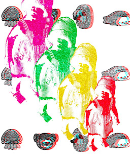
~Filter Gallery> Sketch>Torn Edges>Smoothness
~I put her through 4 different colors in that filter
~I then Merged the layers
~I then found characters on the internet under the search "Kawaii (cute in Japanese) Animals" and used the Magnetic Lasso to cut them out and put them behind her.
~I Merged the Kawaii Animals
~I put the Animals through Adjustments>Black & White
~I Duplicated the Animals layer
~I then used the FX>Blending Options>Clicked On Red and moved the layer slightly to the side to create a distorted, 3D effect
~I took a "TV Static" image from the search engine and used it as the top layer
~I checked the "Normal" box I forgot what it is called) to "Overlay"

I know her mama will enjoy this piece. I do.
I used a YouTube tutorial to help me get effects I searched and will continue to get guidance this way. It reminded me of what we learned in class.

Blog 10 Part 1 Bee Real


This reminded me of something you might see on a stationary. I was going for simple and quick, as I must turn in as many projects as possible. I can not disclude craftsmanship though. I have included my drafts so you can see where I was heading.


I can not for the life of me do a layer mask. I watched a video a few times and paused it at pivotal parts, I also have Photoshop CS6 For Dummies. I must be slower than a dummy because I still need help at achieving a proper piece that includes a layer mask.
This one is the starting point. I was going to add a lot of "B"s unto abstraction, but Dafont was not loading anything properly no matter what I or my tech-savvy fiance did. I had the stencil font already loaded on my computer from class time.

Details:
~I chose a watercolor platter piece and chose a part of it with the Rectangular Marque tool and Cutting it and placing it behind the bee
~I cut out the bee by using the Magnetic Lasso Tool, as it already had a white background
~I used the Free Transform on both images
~I chose "B" with a pattern inside it already (I really wanted to add my own pattern that I would choose for a "B", but I am short on time) and used the Magnetic Lasso and removed it from it's background and into the art space
~I used the Exclusion for the "B" which made it darker to match the bee (at the time)
~I merged the layers
~Then went to Filter>Noise>Dust & Scratches and shifted the Radius and Threshold (which made it "sketchy" looking)


Blog 9 - Illustrated Poem: Two Dark Iwa Birds

"Two dark Iwa birds
rode the currents of tall wind
across the face of the full moon" by Kathryn Takara

I got to use the different paint brushes with this on the foreground and mountains, even the stars. I used different gradients to add depth. I found solitude in this poem. A calmness and quite that creates a resilience in the barrenness of some wild plain that spans in my mind. I can hear the howl of a massive wind, and see two little birds just being against and with it all.

Wednesday, May 2, 2018

Blog 6 Words

This is Antony LaVey's house, which was the headquarters for the Satanic Church in the 60's. 
It has a foreboding red sky behind it with a Corolla I tried hiding with the font in front of it. It is for rent. Would you rent this at a decent asking price?

Project 3 NC CC Design

This is WAY off from what they wanted. I was thinking about a much different design and I came up with the road to enlightenment with a "happy" design. I didn't turn it in after taking a look at the more studious, "professional"-looking designs in the class. I then became embarrassed about it and felt a bit corny.

Project 2 Photo Retouch

I spent WAY too much time on this. It was much more time consuming than I thought it would take. When the teacher showed me to use the Overlay Mode, the fact that I used several different shades for the leaves and grass ended up not even mattering! The different shades that I used on the pony came together nicely and I AM relieved that I took the time on that.

Project 4 Portraits


Portraits

The top one is me. I changed the filter to 'Artistic' and duplicated multiple (about 5-7) layers from more to more detailed and changed to Opacity on each layer from darkest (being the most simple layer) to lightest (the most complex layer). I mirrored myself. I was going for a Rorschach-esque look as I am interested in the human condition. I wanted my image to look blurred as if the viewer is drunk, or I might be something similar, because to find yourself you must lose yourself. I am hoping to continue to find myself. Our images of each other are skewed.

The second one down is of my good friend in Charlotte, Lora and her boyfriend. She is colorful and although she deals with much pain every day, she reaches higher and higher. Hence the nebula. There are 2 backgrounds that I cut up and copy and pasted, adding a Satin and Drop Shadow Effects to sporadically on separate "strips" of background. I outlined their image and duplicated it to make it thicker. I used the Paint and Eraser tool in conjunction to create random, bulbous lines around them. I knew someone that loved using the swirl tool in most of her art and created wings from someone's arms, and morphed heads. I simply went into Layers and used the Swirl effect on the black lines around them.

I am currently working on another portrait but have quite a few to practice on that I would love to finish.

Blog 10 Part 2- Lorelei

I took an image of friends/family member's kid Lorelei in a hat and duplicated her ~Filter Gallery> Sketch>Torn Edges>Smooth...