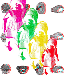
Deborah Panesar
"Rose Pattern"
(*.*.*.under construction.*.*.*)
Louis Durrant
"Camp"
{~-~-~-under construction-~-~-~}
Strawberry Style
"Chafaletti", origami paper
Her pop art and memorable characters that she has turned into stationary icons and vinyl toys are just cute as hell. Enough said. Her Strawberry Style is the updated chibi-form of Strawberry Shortcake. Her patterns are even more sweet as eye candy. The origami paper can be used in a myriad of ways as well as for an add-on to her stationary. The patterns can relate to many cultures; I see old Russia, Japan, Spanish, and even American culture in the simple repetitions. To have multiple products that are generic to a world of cultures is memorable, stand-out-ish, and pretty neat.
Stuart Kinlough
"Digital Communication"
Stuart's art is pure Dada. The clipped magazine and edgy collage look coupled with a digitalized cleanliness creates a fresh twist on a hundred year old art movement. He keeps certain corners or sides fairly void of shapes or patterns, creating a calmness to the chaos of the layers on layers of geometric and main character shapes. It reminds me of the Japanese art that is an ode to the silent void and not always focusing on the expected.
Gemma Correll
"Live Now"
Her art is clean and pop-ish. She has a quarky sense of humour and a positive outlook that shines through her work. Her colors aren't too bright, just easy on the eyes. She creates characters that you might know in real life (a selfish cat, a snobby girl that needs to put on more pants, a strange little girl with her head stuck in a book). It's like the ordinary parts of life spun through an old-timey candy shoppe.


No comments:
Post a Comment